We’re always working to improve our products, and until recently, there were many features available on our desktop site that were not available on the mobile platform. To be honest, it was a bit lacking in functions outside the watchlist. Of course, we want all of our users, including the ones that only use mobile, to benefit from everything we have to offer. So with Version 2.3, we added various features to achieve that goal.
The two main additions in mobile version 2.3 are Trending and Search, both of which we will detail below. We also improved the user experience with cosmetic changes, more features to access on mobile, a redesigned registration flow for the newcomers, and a new sign in screen. (Which you can see right now if you follow one of these icons to the app store and sign in or sign up).
Trending
Trending is the predominant addition to mobile this time around. It was already implemented on the desktop platform, but mobile is arguably the better platform to track trends. In the hyperconnected social media age of today, trends and information about them spread like wildfire across the world. Investors and traders who want to profit from them would do well to act quickly – and since everyone has a smartphone, but no one carries their desktop around with them, we made our Trending feature accessible from the mobile world.
What is Trending?
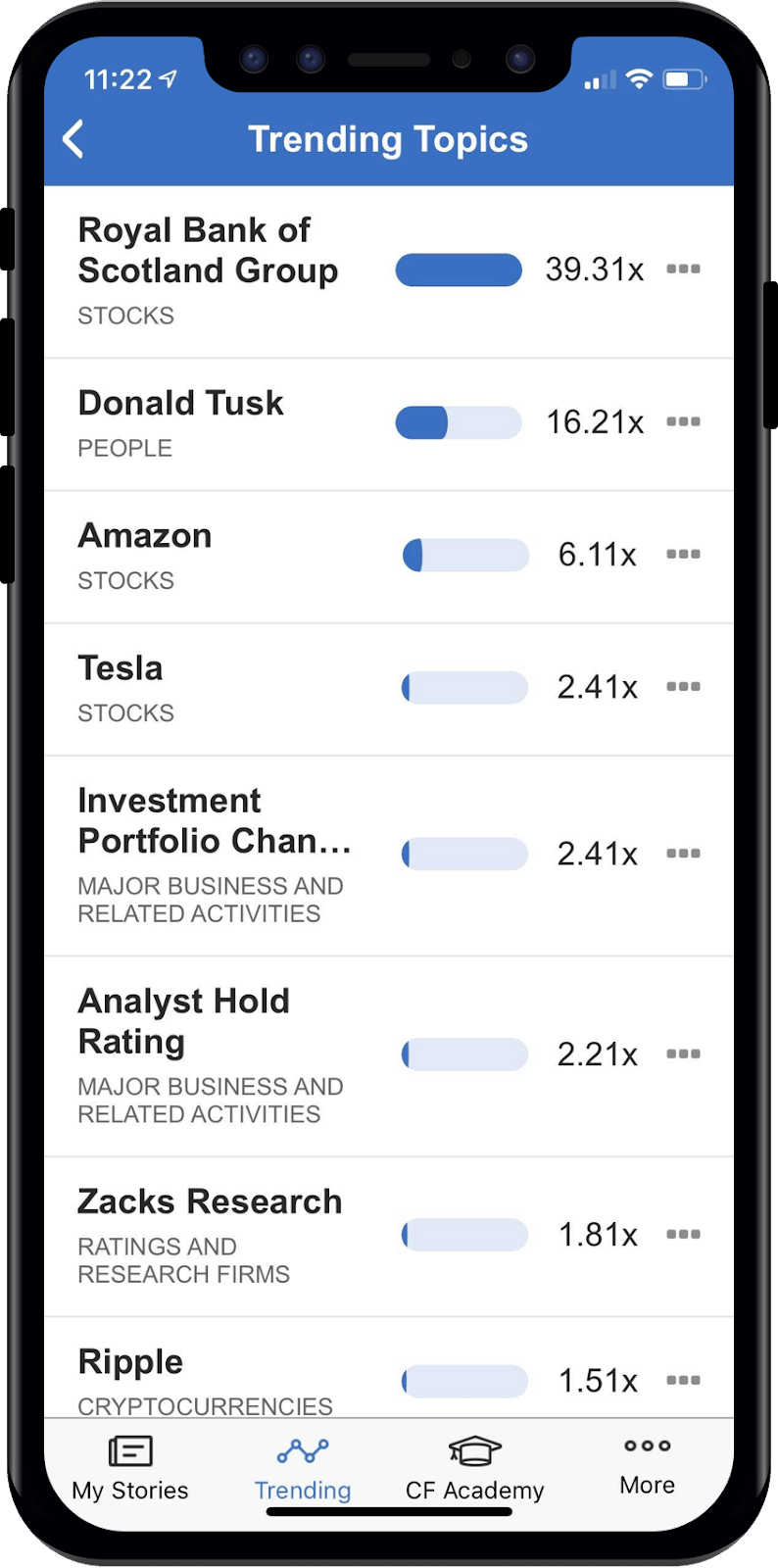
For our mobile-only users who have never actually seen the Trending tab, well do we have a treat for you! Our systems process north of five million pieces of content per day, which means we see a ton of information. When a topic in our database suddenly starts to appear more often, our army of machines takes notice. If a certain threshold is broken, the topic is considering “trending” and we direct the stories to our Trending tab.
In the image below, you can see RBS Group is experiencing a nearly 40-fold increase in content that mentions the company in the past hour. That is obviously a trend to us, and our Trending feature brings this insight to you, all day, every day.
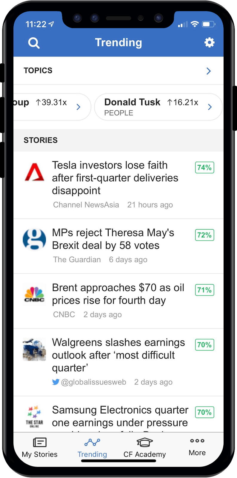
Now, Trending isn’t limited to trends that have developed over the last day, and it doesn’t have to be specifically about companies. If you tap the little gear next to Trending, you’ll be able to modify what exactly constitutes Trending material. After you’ve worked out your trending criteria, the story list should look pretty familiar. The only change is the addition of the trending topics along the top (and the fact these are not on your watchlist).
Tapping on an individual topic in Trending will lead to a screen with the same layout as you would expect from selecting a topic on the Watchlist tab.
Advanced Search
The mobile update this time around was focused on bringing features that assist our users outside the watchlists. Sure, watchlists are still the main attraction at the CityFALCON show, but sometimes (or oftentimes, really), people need one-off searches or just want to look at topics without permanently adding them to a watchlist. Well, now that’s possible with the Search feature (which we had also already implemented on desktop).
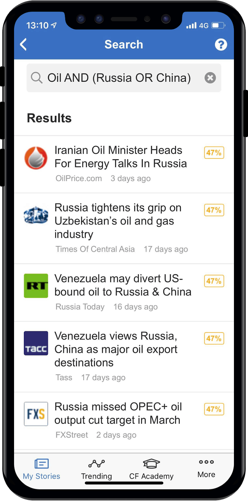
Find a mighty Magnifying Glass, which is the universal symbol for search, and you’ll be able to input any Boolean search query you wish. That includes using complex queries, like AND, NOT, OR, and parentheses or quotes.
If you are unfamiliar with this kind of search, we have a few examples directly available on the app (tap the question mark next to the search box). And we’ve written up a brief explanation cheat sheet here:
AND – every term adjacent to an AND must be included in the results
For example, Oil AND Gold will return results that include both. If one is missing, that story is not shown. If you remember Venn diagrams from your math class, AND is the intersection (overlap) between the two circles.
OR – every term adjacent to an OR may or may not be included
For example, Oil OR Gold will return results containing only oil, containing only gold, or containing both. Using the Venn diagram concept, all content from both circles, inside and outside the intersection, are included.
NOT – terms that follow the NOT operator are, well, not included at all.
For example, searching European Union NOT Euro will return new about the EU but if the story mentions the Euro, it will not be shown. It’s like one circle from the Venn diagram is completely removed. The intersection between the two circles is consequently removed, too.
Quotes are for exact phrasing. “Donald Trump wants to” will return content that has only that exact phrase somewhere in its text. Misspellings may lead to no results if not one has ever used that misspelling before. Because of the exactness of this type, we may guess at what you mean and show you results that are very similar.
Parentheses are used for grouping, just like in math class. So (Gold AND Silver) OR Oil will return content that mentions only oil, both gold and silver together, or all three. But if only gold or only silver is mentioned in a particular news story, that story won’t be shown.
Detailed Selections before committing
There are often many topics in our databases with similar names. This is especially common with product and company names, since so many product names also include the company name directly. Think about smartphones, where flagships often contain the company name, too (Samsung Galaxy S10, Apple iPhone X, Google Pixel). There can also be many variants of a product in series, related commodities, or other topics.
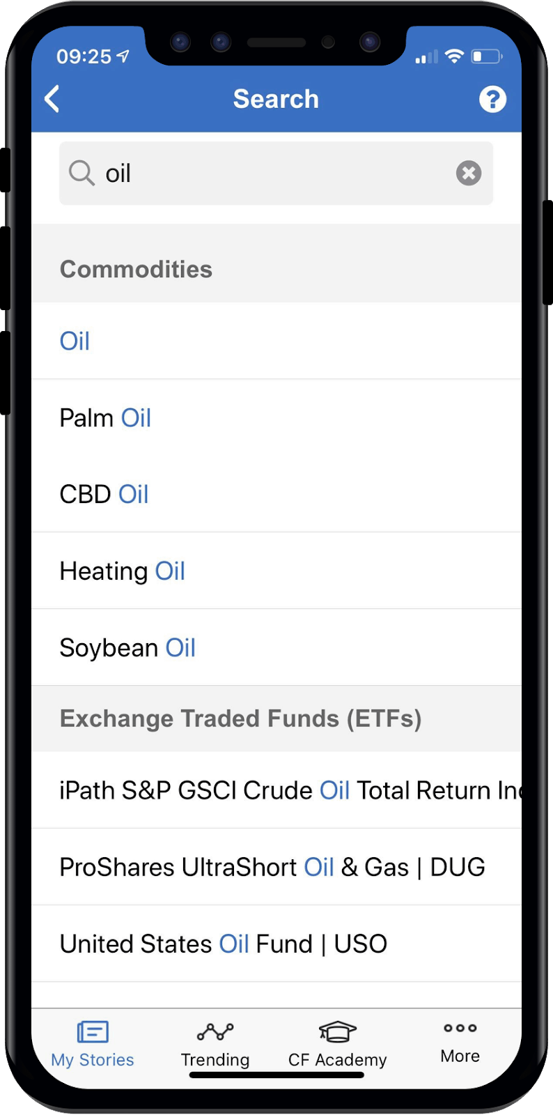
To help customers better specify exactly what they want, we list probable search intentions by category on the search screen before you ever see any stories. A search for “oil” would yield all the possibilities below, and you can easily choose which one you want. We cover many asset classes and categories, with the most common being stocks, commodities, private companies, cryptocurrencies, foreign exchange, bonds, indices, and ETFs. We have ohers, too, so what you need may just be further down the list. Don’t give up if it doesn’t appear at the top!
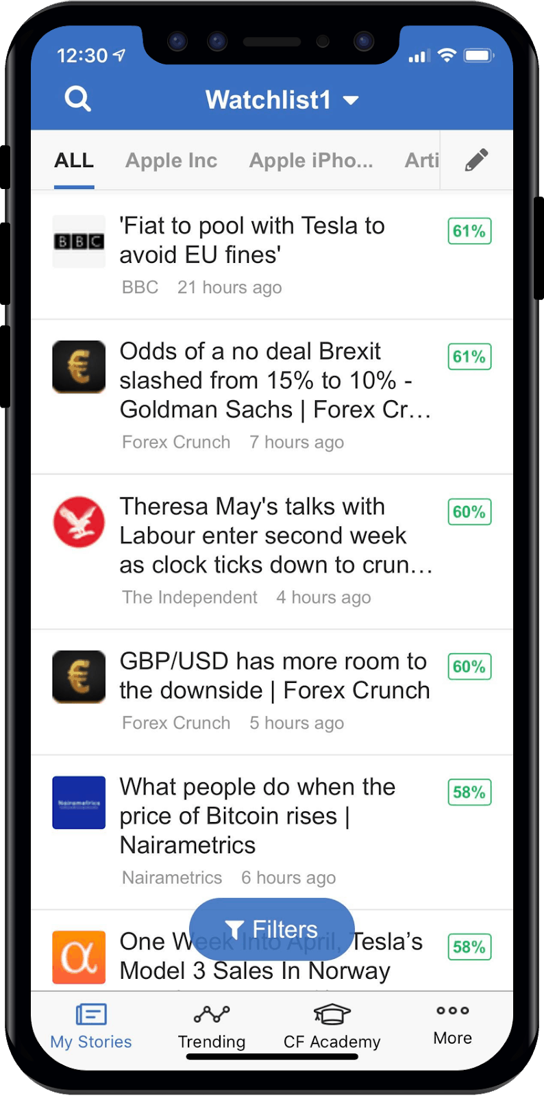
Once the topics are chosen or a complex Boolean search query is made, the results list is exactly the same as any other story result list, which will be familiar from the Watchlist and Trending tabs:
Improved User Experience
We are always trying to improve and streamline the customer experience. Through much feedback, we decided to make a few changes to make using our app better. After all, no one wants to use a frustrating app – and developers don’t really like creating them, as they’re an efficient bunch (see our blog about them too!).
Story Filter Button
We have changed where customers access the Story Filters. Now these filters, available on both the Watchlist tab and the Trending tab, can be modified by tapping the blue Filters button that appears at the bottom of the story list. The filters themselves haven’t changed, but we did make the button to reach them that much more visually appealing.
Personalisation Choices
Previously, users could only toggle the Personalisation feature on and off from mobile. To set the group, one would be required to log into the desktop platform and choose a group, then log into the mobile app to see the changes.
That was rather inconvenient, and we prefer to not inconvenience our customers. So now personalisation options are easily accessible directly from the mobile app. We always were suckers for efficiency.
Removal of Google+ Authentication
Google+ never turned out to be a Facebook killer. We’re not even sure it was a MySpace killer. It seems forced participation in a social network does not a social network make. And Google will actually be shutting down the service in the near future, so we have removed it as an authentication option. Naturally we are keeping Google accounts as an auth option, because we don’t expect Google to shut itself down anytime soon.
This change probably doesn’t affect many users, but those signing in with Google+ be forewarned, it is no longer an option to sign in to CityFALCON. And those that don’t use Google+, you’ll have one less authentication method cluttering up the screen.
Onboarding Process
Our final user experience change (and the final change listed in this blog post) regards the onboarding process. If you are reading our blog and don’t have an account yet, what are you waiting for? It’s free and you’ll get all kinds of cool features if you sign up. So go sign up! if you do it through the mobile app, the process will be smooth sailing. That makes for a great introduction to CityFALCON, because we try to make investing smoother, too.
If you’re already on your smartphone to read the blog, just tap the icon to get started.
For those readers who already have an account, you can now feel confident that your friends and coworkers won’t hate on your choice of news aggregator when you recommend us, because the new onboarding process is easy to navigate, easy to understand, and quickly showcases our best features. We like to think we have a lot of “best features”, so we showcase a lot.
The Next Update
CityFALCON is a work in progress, so we are always on the lookout for improvements. If you happen to have any suggestions, we’re all ears (or eyes, since you’ll probably write to us). You can leave a comment below or use the Contact Us. From within the app, you can leave feedback through the More tab.





Leave a Reply